Friday, December 7, 2012

Study Tour: House of the Immediate Future


In addition to our other study tour visits, our class was able to visit the Seattle Center's exhibit with the House of the Immediate Future, a project put on by Habitat for Humanity. Touring through the space provided a great example of efficient use of space, however as design students, we found a few areas that were poorly planned (oops!). Otherwise, their use of space and consideration of various household necessities were very smart and innovative. Sustainable materials and practices were also fully integrated into the design and provided a great opportunity for our students to learn about utilizing such practices. Although some ideas of the designers didn't seem bery practical (such as placing solar panels outside of a home that is set to be built in one of the rainiest areas of the country). Otherwise, it was an incredibly informative visit and I hope to become involved with habitat for humanity in the future both as a student and as a designer.

Study Tour Sketch Crawl


During our study tour to Seattle, our class had the opportunity to visit the Sculpture garden downtown. We were able to walk around and observe the scupltures, which was ideal for the end of the visit where we sketched the various pieces. Though the weather wasn't the warmest, it was a wonderful sunny day that created interesting shadows and depth within the sculptures. I personally enjoyed the visit because of the oppportunity to sketch outside as well as new subjects.

Study Tour Job Shadow


In September, my peers and myself had the opportunity to attend job shadows with various design firms in downtown Seattle. The firm that I worked with was Weber Thompson, a design firm that works primarily with multi-family housing. As a large firm, their staff includes architects, interior designers, graphic designers, and construction administrators. While doing the job shadow, A classmate of mine and I were able to attend a morning staff meeting, meet with the interior design staff for a short Q & A, visit a site nearby for a client the firm is working with, and tour their offices and materials room.

Overall the experience was very informative as well as motivating. Seeing the projects that the designers get to work with made me that much more excited to be a practicing designer. When visiting the nearby site, (which was a multi-family housing project completed by another firm), the principal designer, Carrie, toured us through the units making note of conderations, challenges, important tips, etc. She also showed us portfolio examples to help us for when we have to create our own in addition to giving us some tips for when we are looking for work after college and the type of skills employers are looking for. The whole visit was a great success and I hope to keep in touch with Carrie for more advice or even for an internship.

Thursday, December 6, 2012

Final Residence Design

For this design, I really wanted to draw from the strong points of my previous designs as well as incorporate a new concept. From there considered what I wanted to take from my original inspiration piece, Eric Clapton's "Back Home", while also taking into consideration my first concept model. By using the words "memories", "trust", and "belong", I came to the conclusion that my design should focus more on the common area and successfully creating a communal space and then applying that design concept to the one bedroom apartment.
For me, the words I chose were things that came from experiences had with family and friends, and with the challenge of the common area being possibly useless to the building tenants, I wanted to use the words as a source of inspiration for creating a common space. The issue of the space lies in its ability to encourage gatherings and provide a refuge away from home that would build a sense of community for each floor. This problem was what I was most determined to address. With that in mind, I took the curves from my original concept model and let them be the focal point of my new parti. After completing several sketches, I chose the one above because of its enclosed circles and realistic application to my design ideas. One particular application of my parti can be seen in one of my seating areas located in the commons that is slightly enclosed by a curved wall. By incorporating this niche, I was also able to include a specific request made by the client to have glass blocks. Seeing as how the common area has very little light, but is a very large space, I sought to find some sort of separation of space while still having the whole area still tie together. I was able to achieve this by topping the wall that separated the seating area from the rest of the space with glass blocks, that while dilineating the space, still provide a sense of cohesion by being relatively translucent.

Another area in which I used my parti to create a division of space was in my kitchen where I integrated a bar which also aided in providing a more visible entryway, rather than just a door leading into the apartment.


For the rest of the apartment and common area, I continued with the same approach, seeking to find opportunities that inspired conversations and gatherings. ADA requirements were also considered in the design and were addressed in all areas of the apartment and living area to ensure easy access for any tenant that might be mobility impaired. Similar materials were selected in comparison to the two bedroom apartment and the color scheme also remained relatively similar with the exception of lighter walls to better accomodate the variety of tenants that will be living in the apartments.


Wednesday, November 28, 2012

Designer Meeting

Over Thanksgiving break, I had the opportunity to meet with Susanne Weaver, a close family friend who currently owns a small boutique in Spokane, WA. Prior to her owning the shop, however, Susanne used to be an interior designer in a small firm that operated out of San Bernadino, California. Most of Susanne's experience with design deals primarily with residential interiors, which proved her expertise to be most useful when I sought her out to review my Palouse apartment design.

Some things that we discussed were my concept and how it applied to my design as well as materials, lighting, and the designs of the common area and apartment. With my concept, she advised that I make my original ideas that I drew from the concept more clear in my designs, and to not take the lyrics from my song so literally. As for my materials, she really liked the combinations of textures and colors, however said that I needed to research my materials better for their intended use seeing as I had brought in a sample for the type of cabinets I wanted and the sample turned out to be for blinds (oops!). She also encouraged me to research other options outside of our research room.

When it came to my designs and floor plans, Susanne gave me simple ideas that I think can help improve my ideas now, as well as in the future with other projects. She suggested multiple solutions for alternative lighting, bathroom layouts, wall colors, material selections, storage ideas, etc. Although I did not change much with my design after the meeting, one suggestion was taken into consideration and inspired this change that I made to my kitchen.

 This is my original kitchen design for my cabinetry, which was created in an effort to look the same as my 2-BR kitchen design. Although Susanne liked the design, she still encouraged me to be more creative and not just create the "standard kitchen". She pointed out that with residential design, apartments especially, there is little room for personalization, because it poses the hazard of deterring potential tenants. It doesn't necessarily mean, however, that there is no room for creative details, which led to my final kitchen design.

With this
With this kitchen, I chose to change one wall of the cabinetry to open shelving that features a variety of storage sizes. In the meeting, we also discussed solutions for the ceiling height and came up with a lowered soffit that rests on the counters, which breaks up the wall a bit and helps the ceiling feel a little lower and the space more cozy. Another change I made after the meeting was lowering the ceiling in the living room, for the same cozy effect, while also creating a feeling of separation between spaces. Overall, the meeting was a great opportunity to find solutions for the questions that I had pertaining to my design, but I found that it was also a great way to get a professionals opinion and learn some common problem solving ideas for the future.

Tuesday, October 23, 2012

Palouse Bathroom Design


For this design, as with my kitchen design, I was driven by the juxtaposition of both curves and more rigid forms that were drawn from my concept model. Both organic forms were the foundation for my selection of materials as well as colors because I wanted the space to evoke a more natural and simplistic aesthetic.

First and foremost, with this particular space, accessibility played a large part in the overall design. Due to the above-counter sink that I chose, I already needed to lower the counter, and made sure that the overall height of the sink met the ADA requirements. As with the toilet, enough space was allowed for side or even front access along with a grab bar placed the south most wall of the bathroom. To ensure that door clearance did not interfere with the 60" wheelchair turn radius, I also opted for a pocket door into the bathroom. Though another solution could have been to have the door open into the hallway, I found that storage areas and another entryway into an adjacent bedroom would make that impermissible.

Storage is an important inclusion in any bathroom and was no exception in this case. A large cabinet was designed into the room as well as additional storage placed underneath the counter. Ample lighting was also provided not only for tasks completed in the bathroom, but also to compliment and allow for such a dark wall color. In addition to wall sconces on each side of the vanity mirror, cove lighting was also incorporated into the space. Though I like the look of all white bathrooms, I chose to warm up the room and make it cozier by darkening the walls. All other materials, however, were selected to follow the clean and simple aesthetic that white bathrooms provide.

When completing my original drawings, I had not originally planned on incorporating any free-standing furniture into the space. I did, however have a free corner of space near the bathtub and instead of adding more storage, chose to add a chair in the event that maybe a parent and child could inhabit this apartment. Bathing for young children often requires accompaniment and extra seating accommodates that need and provides comfortability in a space filled with otherwise hard materials. Overall, I am very satisfied with the design, but might opt for a more creative approach when designing another bathroom.

Monday, October 8, 2012

Concept Development: Palouse Kitchen Design

As a starting point for this concept, I selected the song "Back Home" by Eric Clapton and proceeded to sketch ideas that surrounded the idea of these two great loves discussed in the song. As the lyrics say, the singer is saying how much he misses his home and the comfort he finds there, but is torn between his need to return home and his love for his life on the road. To illustrate these two competing ideals, I constructed a concept model that is composed of a curved central figure flanked by two linear "tracks", which represent the pull and push of conflict. From these developments in my concept, I then went on to start designing small elements that I wanted to incorporate into my spaces such as linear patterns, rectangular shapes that are overlapped, and small areas with curves to mimick the curvature of that central figure. Overall, I am satisfied with my concept, however am considering making small changes so that it is applicable to the various spaces I will design to ensure cohesion.

Palouse Kitchen Design


My revised concept statement goes as follows:

"Mimicking the staggered series of lines from the concept, materials and patterns were selected to provide stability and a sense of being grounded. The overall feeling is of comfort and solidarity, leaving the user at ease and at home."

With this design, I strived to incorporate both the rigidity and repetition of line found in my concept model as well as small areas with curvilinear lines. The juxtaposition in my concept was such an accurate portrayal of my song to me, that I found the integration of both forms very integral to my design. I kept the overall colors very neutral partly due to my own interpretation of how a home should feel. Neutrality and calmness are important characteristics that I associate with home and I opted for these when choosing my materials. I also considered the client, Seth's, request for more natural materials and used that idea as the foundation for my design decisions. The incorporation of small amounts of color, in this case a nice marigold yellow, was taken from my concept model color scheme.

An important goal with the space orientation, for me was to create small areas of interest within a large space. In the entryway I was able to create a desk/nook where bills can be paid or homework can be done. A bookcase on the opposite side of the entryway was included to estabilish a separation of space, entry from living. It also helps to break up the long wall and distinguish the main entrance door from one of the bedroom doors. I placed them close to avoid any conflicts with wall space in case a tv was placed on the east living room wall and then chose to add the open-sided book case.

With this project was confronted with several challenges surrounding the orientation of various elements of the space and how they communicate with each other. With each design decision, a result is created that had a direct effect on some other decision. Design is, in other words, a large puzzle. By spending copious hours researching the different options and solutions used by other designers, I was able to solve my own problems within this space as well as obtain knowledge that wiould easily benefit other designs. Though the design was difficult, it was all-in-all, a necessary learning opportunity that will improve my approach to design next time I am confronted with the chance to design a kitchen.

Ride, Don't Walk Accessibility

As an opportunity to understand the difficulties of manuevering in a wheelchair, I was able to visit some places that I see everyday and view them from another perspective. What I found in most cases, was that although for the most part, the designs might have met ADA codes, they were still unrealistic and hard to operate in for a person in a wheelchair.

 In this instance, the door clearance was enough for passage, however the space between the door and the back wall of the bathroom stall made accessibility beyond difficult due to lack of turn radius for a wheelchair.
 While in the wheelchair, I tried to reach into the bottom of the refrigerator and pull out a drawer. Although this might normally be considered and easy task, I was unable to pull out the drawer with ease because my chair was in the way. The only way to be able to reach the drawer would be to position myslef right next to the fridge, which put in directly in the way of the drawer. I would suggest higher drawers that are along the top portion of the refrigerator, making them more easy to reach.

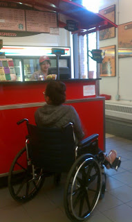
While ordering my drink at the coffee bar that I usually visit everyday, I noticed that I was unable to reach the counter and was so low that I couldn't even see the baristas forehead. It was difficult ordering when unable to see her and because the counter was blocking my line of sight, it was also making so that she had a hard time hearing my order. Afterwards, I went to grab a napkin and had to have someone help me because I was unalbe to reach. The counter that the napkins were on was too deep and they were on a rack that was too tall. As an alternative, I would suggest lowering the condiments and napkins or even having them accessible in bins from the front so that they are not only reachable from the top.

In another bathroom stall, I expereinced the same problems as before, along with the difficulty that came with exiting the stall. The door was placed in an awkward spot in relation to the wall, which posed a problem for turning in the wheelchair. After much frustration, I was eventually able to exit the stall and the bathroom.
Another situation that I found very difficult was turning around in elevators. One elevator allowed enough room for me to turn around, however there was another in a seperate building that I could not fit in unless I turned the wheelchair. If there was, however, other people on the elevator, this would be nearly impossibly or at the very least, time-consuming.
Overall the experience taught me that in addition to simple ADA codes required for a space, practical clearances for wheelchair users need to be considered to allow them as much accessibility as possible. Having to use a wheelchair or any other walking aid is time-consuming enough, and poor design decisions only exacerbate that problem. We, as designers, have a duty to design for everyone and to make proper decisions that make live easier no matter a person's method of mobility.

Client Brief: Seth & St. Elmo's Apartments


St. Elmo's hotel has always been a staple in the small town of Palouse, Washington. In the past few years, however, it has been poorly taken care of and was in need of a facelift. This in turn led to Seth Anawalt, a local businessman, to take on the task who then looked for advice from our design students. From the client interview between both Seth and our design students, we were able to understand the key elements of the desidn that Seth was looking for. He is very interested in sustainable design as well as re-using as many materials from the original interiors as possible. He is also integrating spas and common areas into the design, which were important aspects for us to consider when designing. Among other various details such as materials, colors, and layouts, I was able to get from the interview that everything discussed in a meeting with a client has a meaning. By that I mean that a simple request from a client can easily be applied to multiple aspects of a design to ensure that we are meeting the clients needs. I also found that rigorous notes are very beneficial for referencing and that correspondence with a client throughout the process is very crucial. Although the correspondence hasn't played a large part in our designing of the space, I was still able to take from this interview all the important aspects that need to be considered in the process of designing for a client.

Context Poster: Sustainable Kitchen Remodel


With this case study, I had the chance to overview a remodel with the intent of creating a new space that reflected sustainable and functional values. Green materials were carefully chosen and helped to make the new space less wasteful and longer-lasting over time with low-maintenance. From this case study, I was able to better understand the different components that go into a kitchen remodel as well as become more cognizant of various sustainable materials available today. This also provided to be a great opportunity to see the various problems and solutions considered in a remodel in terms of functionality.

Tuesday, May 1, 2012

Process Poster


For this project, the task was to make a poster that summarized the design process used to create a concept model. To begin with, a nature object was selected that was an abstract representation of a chosen designers overall aesthetic. The nature object was then transformed into parti drawings that then inspired a 2-D concept model. The concept model was intended as a 2-d representation of the extension of lines found in leaves. The concept of the lines extending from a central core was then taken into the next design process of creating a concept model for a furniture piece. The room in which it resides was thought to be a calming room, where the user would be able to sit and relax, maybe read a book. To help create that ambiance, a sort of stool was designed that elevated the user above the floor and set a tone for the room that encouraged isolation in a comforting way. Personal motivations helped to conclude that a light source underneath the stool would also create a calming effect, given that the furniture piece would be made of some sort of translucent material. A series of lines would also seemingly grow out from underneath the seat which would create patterns on the walls of the room and help immerse the user in the soft glow and make them feel as if they are surrounded by nature.

Monday, April 30, 2012

Sophomore ID Student Presentations

I recently had the opportunity to attend a few presentation  put together by second year Interior Design students. The project was to find the optimal remodel solutions for a train depot located by downtown Pullman, with their client being an artist of their choice. As with all design projects, they began with an inspiration piece and then followed that with parti drawings. A single parti drawing was then chosen and created the basis for their design of the depot. The design has to also accommodate any visually or physically impaired user that might enter the space to visit the gallery, residence, etc.
I found the presentations very interesting and was appreciative of the opportunity to see what kind of projects that I will be working on next year. By attending, I was also able to gather more information about the considerations that must be made for any handi-capable person. The process included in making space designs was another important factor for me, because it expands on my own ideas of how design should be approached and helps me to better consider other facets of my designs that I might not have thought of before. Overall, the experience provided helpful tips for my projects next year and I truly enjoyed seeing the talented work of the second year students.

Wednesday, April 18, 2012

Assignment 5- Resume

This assignment was used as an extension of our logo assignment as an opportunity to create a resume that reflects our knowledge of design and personalities as designers. The resume was also a valuable opportunity to become more familiar with InDesign. I had already previously made a resume, which allowed for me to spend more time on the composition and organization of my resume, rather than the content. I was already content with my former resume, however after making this new one, I have found that this one is much more visually appealing and will likely be the copy that I show to interviewers from now on. This assignment not only helped me to learn about proper composition and inclusion of content in relation to design, but it also helped me to experiment more with graphic elements that reflect my personal design aesthetic.

Wednesday, April 11, 2012

Monday, April 9, 2012

Logo Design


For this assignment, the task was to create a logo that properly represented our design aesthetic and familiarize ourselves with Adobe Illustrator. The project as a whole was challenging, but was very informative in that I am now more comfortable with using Illustrator as well as the Wacom Tablets. Although I am satisfied with my current logo, I can easily see myself making changes in the future as my taste changes.

Wednesday, March 21, 2012

Wednesday, February 15, 2012

Historical Textile Pattern


This is another pattern created with Greek art in mind. I considered all of the iconic designs and art pieces that are associated with the Greek's and knew that the inclusion of Greek columns and scrolls would be integral to creating a pattern that successfully represented their culture. The center image was one that I found depicting an ancient story about mythical creatures that came to Greeks from the gods. The story was fascinating and I found the inclusion of the art piece to be a great addition to the pattern because of how it complimented the other colors already present in the design. This was my second opportunity to work with Photoshop and was very proud of my progress in learning to work with the program.

Greek 4th Century Art Pattern


This pattern was created to combine elements of Greek 4th Century art into one cohesive piece. Although challenging, I found that the images for this particular historical period were very similar in terms of color's used for the art as well as the overall color of the materials used in some cases dealing with sculptures. This being my first time working with Photoshop, I found some tasks extremely difficult, however had the opportunity to learn quite a bit throughout the process of completing the pattern. My following projects show my increasing ability to work with the program, which makes me look forward to the day when I am able to make more professional and creative projects.

Class Sketches 1-3