Showing posts with label Accessibility. Show all posts

Monday, April 29, 2013

Pufferbelly Depot Final Design

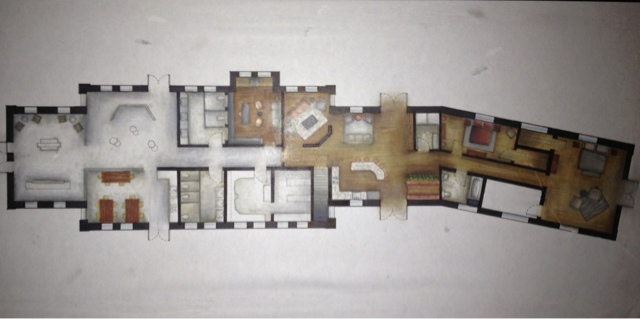
                   As the popularity of sustainable design grows, so has the interest in adaptive reuse as a means to revitalize old structures and allow them to function more appropriately with modern needs. Such is with the Pufferbelly Depot, an old train depot in Pullman, Wa that has stood for nearly a century and no longer exemplifies the burgeoning success that the Palouse region once possessed. Our client, a local artist, had realized its dilapidated state and was seeking to renovate the depot into an art gallery, artist's studio, and residential space.


Not even considering their desire to remain on the state historic registry, this project served as a challenge because it had to serve so many purposes. Nevertheless, the depot was a fantastic opportunity to explore my creativity in the commercial side of the space and further improve my understanding of residential design. 


To start out, I began with this photo, which after completing many sketches grew in to my concept model (shown below). After completing my concept model, I contemplated how I wanted to proceed with my design. My concept words were gradation, movement, and tension, which I felt very strongly explained my concept to that point. They were such different elements and principles of design however, that I sought to narrow them down, which led me to continue on with the idea of tension that I described in an earlier post. After considering my artist's work however, I strayed from my initial ideas to explore how I could best incorporate her jewelry designs. 


The photos above are a combination of ones that I had taken myself at two different museums in the Seattle area, and other display solutions that I found interesting and wanted to include in my design. The top most seemed to fit well with my artist's work because it highlighted the smaller items so well without drawing on the fact that they are so small in comparison to the large scale of the room. The second photo features a similar display method that better fit the overall aesthetic that I was seeking and was more representative of the amounts of natural light that I would need to tend to. 


Building upon my sketches of what I felt tension would look like in a 2-D form, I took this photo of staggered pedestals in varying heights in one of the museums I visited. Drawing on my artist and the inspiration that I had gotten from the photos and my own inspiration photo, I proceeded to design display pedestals that were hexagonal in shape, mimicking the faceted bead that my artist makes. Photos earlier on in this post illustrate my pedestal designs and how they compliment my display wall with the hollow case, also shaped with facets like a hexagon.


By far, my bench design was my favorite part of this whole design project and though it was incredibly difficult to make, it represented my concept so well and stood as the most visually compelling element of my depot design. Overall this whole project served to make this semester very challenging with how much work it required. The most valuable lessons I learned with this project were about appropriateness of materials, more abstract ways of thinking and developing a concept, and most importantly, how to manage my time. I have learned so much in my last two years as an interior design student, but the most difficult aspects have always been with estimating how long each part of a project will take and what deserves the most time. I can proudly say that my perspectives are by far the best I have ever completed, however I also know that I made a mistake in spending so much time on them, and due to that, some other aspects of my project suffered. I look forward to my next opportunity to improve my time management abilities and to create a new space that explores my creativity. 


Tuesday, March 19, 2013

Visual Impairment Exercise

As designers, it is incredibly important to understand how our clients live and function within a space. Our duties go beyond just making beautiful interiors because functionality and ease of use is ultimately what determines the success of a design over time. To further explore our current client's disability, some peers and myself completed some exercises to understand as best as we could what it is like to live with various forms of visual impairment.


The above photos show our team attempting to read with the impaired vision cards and a plastic bag, both of which simulated different kinds of vision loss. These weren't very difficult, and even seemed similar to my vision without contact lenses. The challenge of having decreased visual function was, however, put much more in perspective once we began walking through the building with glasses that represented partial loss of vision and that of a legally blind individual.


Watching my other peers, I was aware that the glasses were hard to see through, though I still did not anticipate just how difficult it would be to navigate my way through the building. As we all took turns completing the exercises, We all noticed successful ways in which signs, lighting, wall colors, and even buttons were in indicating various cues to a person who is visually imparied. Unfortunately, we also managed to find ways in which accessible design decisions were insufficient or absent altogether.

Some helpful cues were dark slip-resistant strips when going up or down the stairs to indicate the end or beginning of each stair tread. The more successful application was in the Holland Terrell Library Atrium (as shown above on the right), which had white stairs and black slip-resistant strips, which was much easier to see with the glasses due to the high contrast. Looking at the photo above on the left, any person with normal vision might assume that the contrast between the green stairs and black strips is perfectly sufficient. We found that with the glasses, the stairs just appear green and provide no clear indication of a change in levels. An easy change that might help the visibility of the stairs would be to add lighting about the stairs. The surface of the stairs is much more reflective than the strips, which might provide more contrast for users unable to detect each level of the stairs.

 One part of the exercise was to try to use two ATM's in the building, though we chose to try all four and a Redbox kiosk as well. What we noticed immediately was the audio assistance jack for headphones and the keypads, which all varied slightly. The proximity of the keypad to the jack was another observation that we made, due to three having them right next to each other, while another had them placed on seperate surfaces of the ATM.


For a person who suffers from severe or even moderate vision loss, the jack and keypad that are placed close together would likely be much more successful because that is likely the first place that they would reach out to. The jacks placed next to the keypad also had a larger and more detailed braille pad which I would assume would be easier to feel versus the small pad near the screen that has little braille and could be mistaken for just another textured surface on the machine.
One other helpful device on the machine was the slot in which a user would place their card. Every machine had some sort of light that indicated where to insert the card, however, the slots that lit up the area directly around the slot seemed much easier to use than the machines that had a light directly above or below it. By lighting areas other than the slot, it promped my classmates and myself to try to fit our cards where the light was flashing, which was not correct. Instead we were left fumbling with the machine until we finally found the slot to insert our cards.

Overall, the experience proved to be very valuable to us as learning designers and provided us with an opportunity to "see" firsthand what challenges visually impaired people face everyday. Though some measures to visually aid users might not have been ideal, the consideration for those who have to struggle to complete everyday tasks was admired and acknowledged by each of my peers and myself. From this experience, I hope to take our collective observations and create spaces that are functional and easy to use for any given person.

Thursday, December 6, 2012

Final Residence Design

For this design, I really wanted to draw from the strong points of my previous designs as well as incorporate a new concept. From there considered what I wanted to take from my original inspiration piece, Eric Clapton's "Back Home", while also taking into consideration my first concept model. By using the words "memories", "trust", and "belong", I came to the conclusion that my design should focus more on the common area and successfully creating a communal space and then applying that design concept to the one bedroom apartment.
For me, the words I chose were things that came from experiences had with family and friends, and with the challenge of the common area being possibly useless to the building tenants, I wanted to use the words as a source of inspiration for creating a common space. The issue of the space lies in its ability to encourage gatherings and provide a refuge away from home that would build a sense of community for each floor. This problem was what I was most determined to address. With that in mind, I took the curves from my original concept model and let them be the focal point of my new parti. After completing several sketches, I chose the one above because of its enclosed circles and realistic application to my design ideas. One particular application of my parti can be seen in one of my seating areas located in the commons that is slightly enclosed by a curved wall. By incorporating this niche, I was also able to include a specific request made by the client to have glass blocks. Seeing as how the common area has very little light, but is a very large space, I sought to find some sort of separation of space while still having the whole area still tie together. I was able to achieve this by topping the wall that separated the seating area from the rest of the space with glass blocks, that while dilineating the space, still provide a sense of cohesion by being relatively translucent.

Another area in which I used my parti to create a division of space was in my kitchen where I integrated a bar which also aided in providing a more visible entryway, rather than just a door leading into the apartment.


For the rest of the apartment and common area, I continued with the same approach, seeking to find opportunities that inspired conversations and gatherings. ADA requirements were also considered in the design and were addressed in all areas of the apartment and living area to ensure easy access for any tenant that might be mobility impaired. Similar materials were selected in comparison to the two bedroom apartment and the color scheme also remained relatively similar with the exception of lighter walls to better accomodate the variety of tenants that will be living in the apartments.


Tuesday, October 23, 2012

Palouse Bathroom Design


For this design, as with my kitchen design, I was driven by the juxtaposition of both curves and more rigid forms that were drawn from my concept model. Both organic forms were the foundation for my selection of materials as well as colors because I wanted the space to evoke a more natural and simplistic aesthetic.

First and foremost, with this particular space, accessibility played a large part in the overall design. Due to the above-counter sink that I chose, I already needed to lower the counter, and made sure that the overall height of the sink met the ADA requirements. As with the toilet, enough space was allowed for side or even front access along with a grab bar placed the south most wall of the bathroom. To ensure that door clearance did not interfere with the 60" wheelchair turn radius, I also opted for a pocket door into the bathroom. Though another solution could have been to have the door open into the hallway, I found that storage areas and another entryway into an adjacent bedroom would make that impermissible.

Storage is an important inclusion in any bathroom and was no exception in this case. A large cabinet was designed into the room as well as additional storage placed underneath the counter. Ample lighting was also provided not only for tasks completed in the bathroom, but also to compliment and allow for such a dark wall color. In addition to wall sconces on each side of the vanity mirror, cove lighting was also incorporated into the space. Though I like the look of all white bathrooms, I chose to warm up the room and make it cozier by darkening the walls. All other materials, however, were selected to follow the clean and simple aesthetic that white bathrooms provide.

When completing my original drawings, I had not originally planned on incorporating any free-standing furniture into the space. I did, however have a free corner of space near the bathtub and instead of adding more storage, chose to add a chair in the event that maybe a parent and child could inhabit this apartment. Bathing for young children often requires accompaniment and extra seating accommodates that need and provides comfortability in a space filled with otherwise hard materials. Overall, I am very satisfied with the design, but might opt for a more creative approach when designing another bathroom.

Monday, October 8, 2012

Ride, Don't Walk Accessibility

As an opportunity to understand the difficulties of manuevering in a wheelchair, I was able to visit some places that I see everyday and view them from another perspective. What I found in most cases, was that although for the most part, the designs might have met ADA codes, they were still unrealistic and hard to operate in for a person in a wheelchair.

 In this instance, the door clearance was enough for passage, however the space between the door and the back wall of the bathroom stall made accessibility beyond difficult due to lack of turn radius for a wheelchair.
 While in the wheelchair, I tried to reach into the bottom of the refrigerator and pull out a drawer. Although this might normally be considered and easy task, I was unable to pull out the drawer with ease because my chair was in the way. The only way to be able to reach the drawer would be to position myslef right next to the fridge, which put in directly in the way of the drawer. I would suggest higher drawers that are along the top portion of the refrigerator, making them more easy to reach.

While ordering my drink at the coffee bar that I usually visit everyday, I noticed that I was unable to reach the counter and was so low that I couldn't even see the baristas forehead. It was difficult ordering when unable to see her and because the counter was blocking my line of sight, it was also making so that she had a hard time hearing my order. Afterwards, I went to grab a napkin and had to have someone help me because I was unalbe to reach. The counter that the napkins were on was too deep and they were on a rack that was too tall. As an alternative, I would suggest lowering the condiments and napkins or even having them accessible in bins from the front so that they are not only reachable from the top.

In another bathroom stall, I expereinced the same problems as before, along with the difficulty that came with exiting the stall. The door was placed in an awkward spot in relation to the wall, which posed a problem for turning in the wheelchair. After much frustration, I was eventually able to exit the stall and the bathroom.
Another situation that I found very difficult was turning around in elevators. One elevator allowed enough room for me to turn around, however there was another in a seperate building that I could not fit in unless I turned the wheelchair. If there was, however, other people on the elevator, this would be nearly impossibly or at the very least, time-consuming.
Overall the experience taught me that in addition to simple ADA codes required for a space, practical clearances for wheelchair users need to be considered to allow them as much accessibility as possible. Having to use a wheelchair or any other walking aid is time-consuming enough, and poor design decisions only exacerbate that problem. We, as designers, have a duty to design for everyone and to make proper decisions that make live easier no matter a person's method of mobility.