Showing posts with label Sustainable design. Show all posts

Monday, April 29, 2013

Pufferbelly Depot Final Design

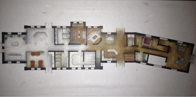
                   As the popularity of sustainable design grows, so has the interest in adaptive reuse as a means to revitalize old structures and allow them to function more appropriately with modern needs. Such is with the Pufferbelly Depot, an old train depot in Pullman, Wa that has stood for nearly a century and no longer exemplifies the burgeoning success that the Palouse region once possessed. Our client, a local artist, had realized its dilapidated state and was seeking to renovate the depot into an art gallery, artist's studio, and residential space.


Not even considering their desire to remain on the state historic registry, this project served as a challenge because it had to serve so many purposes. Nevertheless, the depot was a fantastic opportunity to explore my creativity in the commercial side of the space and further improve my understanding of residential design. 


To start out, I began with this photo, which after completing many sketches grew in to my concept model (shown below). After completing my concept model, I contemplated how I wanted to proceed with my design. My concept words were gradation, movement, and tension, which I felt very strongly explained my concept to that point. They were such different elements and principles of design however, that I sought to narrow them down, which led me to continue on with the idea of tension that I described in an earlier post. After considering my artist's work however, I strayed from my initial ideas to explore how I could best incorporate her jewelry designs. 


The photos above are a combination of ones that I had taken myself at two different museums in the Seattle area, and other display solutions that I found interesting and wanted to include in my design. The top most seemed to fit well with my artist's work because it highlighted the smaller items so well without drawing on the fact that they are so small in comparison to the large scale of the room. The second photo features a similar display method that better fit the overall aesthetic that I was seeking and was more representative of the amounts of natural light that I would need to tend to. 


Building upon my sketches of what I felt tension would look like in a 2-D form, I took this photo of staggered pedestals in varying heights in one of the museums I visited. Drawing on my artist and the inspiration that I had gotten from the photos and my own inspiration photo, I proceeded to design display pedestals that were hexagonal in shape, mimicking the faceted bead that my artist makes. Photos earlier on in this post illustrate my pedestal designs and how they compliment my display wall with the hollow case, also shaped with facets like a hexagon.


By far, my bench design was my favorite part of this whole design project and though it was incredibly difficult to make, it represented my concept so well and stood as the most visually compelling element of my depot design. Overall this whole project served to make this semester very challenging with how much work it required. The most valuable lessons I learned with this project were about appropriateness of materials, more abstract ways of thinking and developing a concept, and most importantly, how to manage my time. I have learned so much in my last two years as an interior design student, but the most difficult aspects have always been with estimating how long each part of a project will take and what deserves the most time. I can proudly say that my perspectives are by far the best I have ever completed, however I also know that I made a mistake in spending so much time on them, and due to that, some other aspects of my project suffered. I look forward to my next opportunity to improve my time management abilities and to create a new space that explores my creativity. 


Friday, December 7, 2012

Study Tour: House of the Immediate Future


In addition to our other study tour visits, our class was able to visit the Seattle Center's exhibit with the House of the Immediate Future, a project put on by Habitat for Humanity. Touring through the space provided a great example of efficient use of space, however as design students, we found a few areas that were poorly planned (oops!). Otherwise, their use of space and consideration of various household necessities were very smart and innovative. Sustainable materials and practices were also fully integrated into the design and provided a great opportunity for our students to learn about utilizing such practices. Although some ideas of the designers didn't seem bery practical (such as placing solar panels outside of a home that is set to be built in one of the rainiest areas of the country). Otherwise, it was an incredibly informative visit and I hope to become involved with habitat for humanity in the future both as a student and as a designer.

Thursday, December 6, 2012

Final Residence Design

For this design, I really wanted to draw from the strong points of my previous designs as well as incorporate a new concept. From there considered what I wanted to take from my original inspiration piece, Eric Clapton's "Back Home", while also taking into consideration my first concept model. By using the words "memories", "trust", and "belong", I came to the conclusion that my design should focus more on the common area and successfully creating a communal space and then applying that design concept to the one bedroom apartment.
For me, the words I chose were things that came from experiences had with family and friends, and with the challenge of the common area being possibly useless to the building tenants, I wanted to use the words as a source of inspiration for creating a common space. The issue of the space lies in its ability to encourage gatherings and provide a refuge away from home that would build a sense of community for each floor. This problem was what I was most determined to address. With that in mind, I took the curves from my original concept model and let them be the focal point of my new parti. After completing several sketches, I chose the one above because of its enclosed circles and realistic application to my design ideas. One particular application of my parti can be seen in one of my seating areas located in the commons that is slightly enclosed by a curved wall. By incorporating this niche, I was also able to include a specific request made by the client to have glass blocks. Seeing as how the common area has very little light, but is a very large space, I sought to find some sort of separation of space while still having the whole area still tie together. I was able to achieve this by topping the wall that separated the seating area from the rest of the space with glass blocks, that while dilineating the space, still provide a sense of cohesion by being relatively translucent.

Another area in which I used my parti to create a division of space was in my kitchen where I integrated a bar which also aided in providing a more visible entryway, rather than just a door leading into the apartment.


For the rest of the apartment and common area, I continued with the same approach, seeking to find opportunities that inspired conversations and gatherings. ADA requirements were also considered in the design and were addressed in all areas of the apartment and living area to ensure easy access for any tenant that might be mobility impaired. Similar materials were selected in comparison to the two bedroom apartment and the color scheme also remained relatively similar with the exception of lighter walls to better accomodate the variety of tenants that will be living in the apartments.


Monday, October 8, 2012

Context Poster: Sustainable Kitchen Remodel


With this case study, I had the chance to overview a remodel with the intent of creating a new space that reflected sustainable and functional values. Green materials were carefully chosen and helped to make the new space less wasteful and longer-lasting over time with low-maintenance. From this case study, I was able to better understand the different components that go into a kitchen remodel as well as become more cognizant of various sustainable materials available today. This also provided to be a great opportunity to see the various problems and solutions considered in a remodel in terms of functionality.