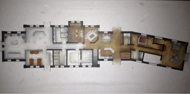
Not even considering their desire to remain on the state historic registry, this project served as a challenge because it had to serve so many purposes. Nevertheless, the depot was a fantastic opportunity to explore my creativity in the commercial side of the space and further improve my understanding of residential design.
To start out, I began with this photo, which after completing many sketches grew in to my concept model (shown below). After completing my concept model, I contemplated how I wanted to proceed with my design. My concept words were gradation, movement, and tension, which I felt very strongly explained my concept to that point. They were such different elements and principles of design however, that I sought to narrow them down, which led me to continue on with the idea of tension that I described in an earlier post. After considering my artist's work however, I strayed from my initial ideas to explore how I could best incorporate her jewelry designs.
The photos above are a combination of ones that I had taken myself at two different museums in the Seattle area, and other display solutions that I found interesting and wanted to include in my design. The top most seemed to fit well with my artist's work because it highlighted the smaller items so well without drawing on the fact that they are so small in comparison to the large scale of the room. The second photo features a similar display method that better fit the overall aesthetic that I was seeking and was more representative of the amounts of natural light that I would need to tend to.
Building upon my sketches of what I felt tension would look like in a 2-D form, I took this photo of staggered pedestals in varying heights in one of the museums I visited. Drawing on my artist and the inspiration that I had gotten from the photos and my own inspiration photo, I proceeded to design display pedestals that were hexagonal in shape, mimicking the faceted bead that my artist makes. Photos earlier on in this post illustrate my pedestal designs and how they compliment my display wall with the hollow case, also shaped with facets like a hexagon.
By far, my bench design was my favorite part of this whole design project and though it was incredibly difficult to make, it represented my concept so well and stood as the most visually compelling element of my depot design. Overall this whole project served to make this semester very challenging with how much work it required. The most valuable lessons I learned with this project were about appropriateness of materials, more abstract ways of thinking and developing a concept, and most importantly, how to manage my time. I have learned so much in my last two years as an interior design student, but the most difficult aspects have always been with estimating how long each part of a project will take and what deserves the most time. I can proudly say that my perspectives are by far the best I have ever completed, however I also know that I made a mistake in spending so much time on them, and due to that, some other aspects of my project suffered. I look forward to my next opportunity to improve my time management abilities and to create a new space that explores my creativity.


