While on spring break, I had the opportunity to visit the Seattle Art Museum and use their exhibits as a reference for an upcoming design project that includes a gallery and retail space. My particular artist whose work will be featured in both these spaces makes jewelry, which prompted me to focus more on the exhibits that included smaller pieces. Though I already have several ideas for how I might arrange the displays of her work (primarily in the gallery), I still was open to finding some other solutions and seeing "how the pros do it" so to speak.
"Going For Gold" was the title of the exhibit I observed and I quickly saw some methods of displaying the work that I wanted to venture from. Most all of the small pieces in the collection were housed in cases that allowed visitors to view them from a sitting or standing position, which placed them just above the height of my waist. Though I appreciated the strategically designed height of each display case, I found them slightly monotonous and hope to stagger the heights of my cases to coincide with my concept as well as add visual interest.
As indicated by the title of the exhibit, nearly all the pieces were made of gold, usually with other jewels or shells and were often painted, wrapped in dyed threads and fabrics, or were finished with tools that made textural impressions along the surfaces. Most were made during Asian dynasties hundreds of years ago and have survived beautifully.
In contrast with most of the other exhibits featured in the museum, this particular section was very dark in color and had relatively low ambient lighting with spotlights set on the display cases. Due to the drastic changes in light from the exhibit before this collection and then the one that immediatly followed, which both had much brighter lighting, a sense of direction was created to indicate the flow that a viewer was expected to follow. Though I was not to fond of the dark nature of the exhibit, it did work well with the pieces and really highlighted the intricate ornamentation on each item. With bright lighting, the details could have diminished into the rest of the piece, which would have taken away from what made them each so beautiful.
With the jewelry that my particular artist produces, such a scheme would appear boring and dull because they are so simplistic in appearance. Brighter lighting and and lighter overall color scheme would highlight her work more effectively and would only elevate the modern aesthetic of each piece. In terms of the small pedestals used within some of the cases, I was very impressed with how successful they were at adding a larger presence to even the smallest items in the collection. I hope to somehow incorporate their methods of displaying small objects into my own design and take what I can from my visit. While wandering through the rest of the museum, I took some other photos of displays/lighting systems/signage/etc that I thought might work for my own design. As seen in the photo above, the cards that rested on the front of the display shelves seemed an ideal place for information.
I had already considered the idea of decals or some sort art in the gallery and was only further inspired after seeing this image on the wall that appears to reflect the small statue that stands just in front. The tie between the two is easy to understand, but it is a successful application in that it manages to reinforce the art culturally and allows viewers to feel more connected by "theme-ing" the room. My artist's work is very geometric so while I might not be sticking large images of primal statues on the walls, I am very interested in using images that resemble her work to further tie in the jewelry and illustrate her style.
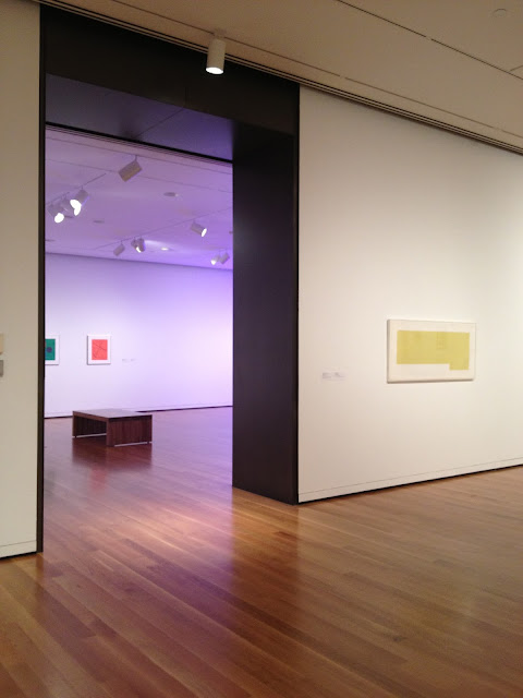
As for way finding, what I noticed most often was that in the more well-lit spaces, there would be an area just on the precipice of the transition into the next room in which the lighting dimmed. In the photo above, the threshold is lit with one singular light and then transitions into the next space that often had a piece directly in front of you as you walked in, which was almost always highlighted with bright spotlights. After seeing a few of these same scenarios throughout the museum, I realized that it created a focal point or a point of interest that draws viewers from one room to the next. Within each room, I can imagine that it would be hard to direct every person in the same direction when there are no barriers to guide them. From room to room though, simple lighting solutions were used to imply a pathway for people to follow.
Unfortunately due to the nature of my artist's work, the gallery will likely be very small in size. As with the lighting and other methods of displaying pieces, I won't be able to apply every idea directly to my design, however I did come up with plenty of ideas for my gallery that will hopefully resemble the professionally curated Seattle Art Museum.

+-+Main+Sign+4.jpg)


